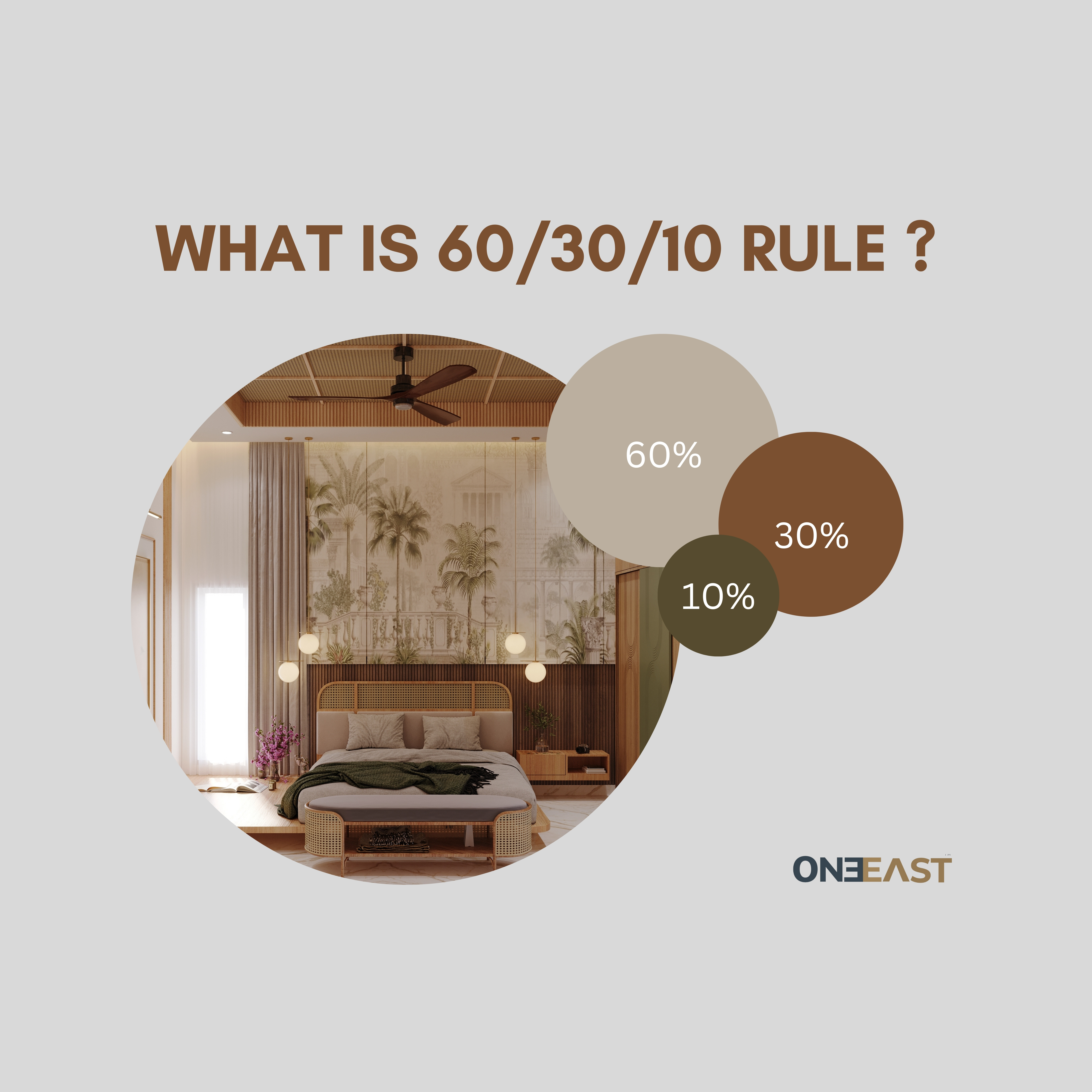
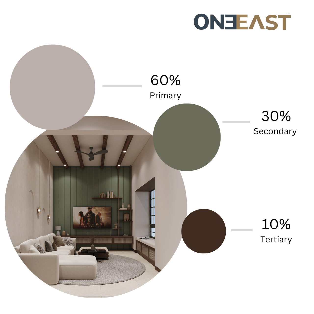
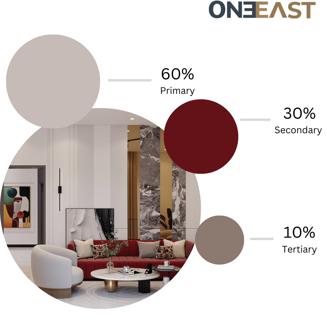
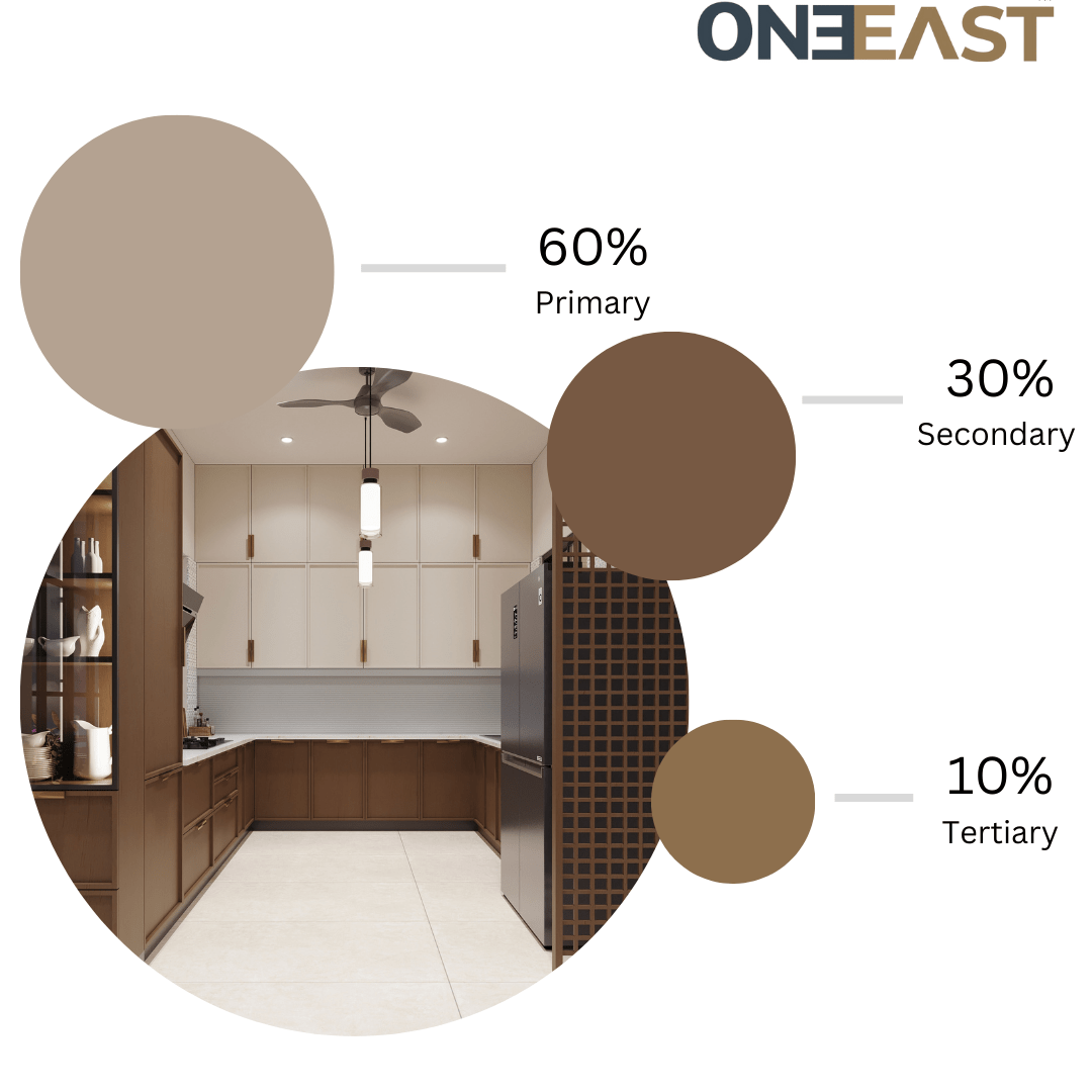
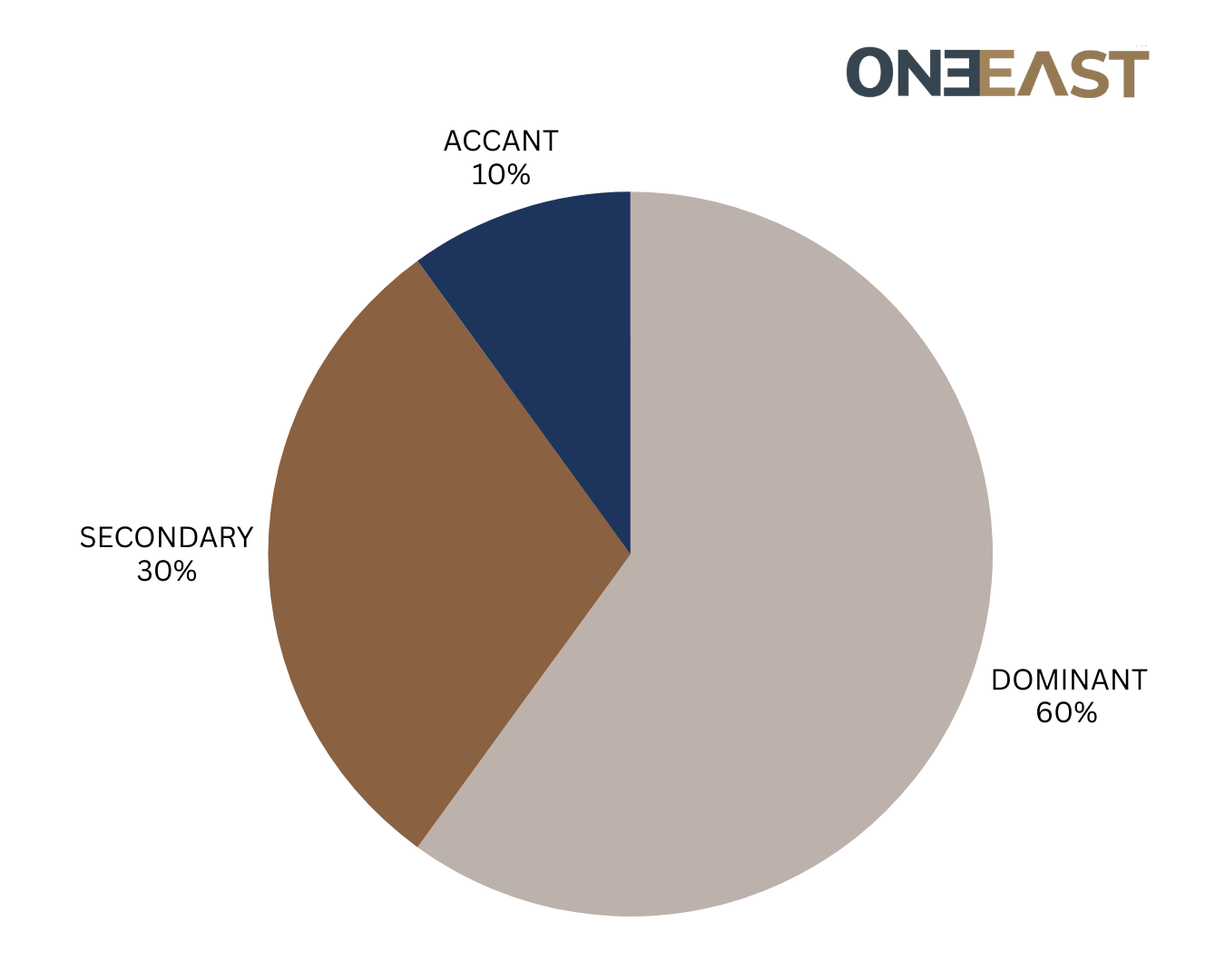
The 60-30-10 rule is a timeless design principle used across various creative disciplines such as interior design, graphic design, and fashion. It provides a clear structure for color distribution to create visually appealing, harmonious compositions.

1. The 60% Dominant Color
Â
Purpose:
The dominant color is the foundation of your design and sets the overall tone. This proportion establishes the backdrop and gives the design a sense of cohesion and stability.
Characteristics:
- It covers the largest area in the design.
- Usually neutral, muted, or less intense to avoid overwhelming the viewer.
- Acts as a unifying element to tie other components together.
Applications:
- Interior Design: Wall paint, flooring, or large furniture like a sofa.
- Graphic Design: Background color in a website or poster.
- Fashion: Main garment like a dress or suit.
2. The 30% Secondary Color
Purpose:
The secondary color complements or contrasts the dominant color to add depth and interest. It helps break the monotony while still working harmoniously with the dominant shade.
Characteristics:
- Covers a smaller area but is noticeable enough to create contrast.
- Can be slightly more vibrant or saturated than the dominant color.
- Should blend well with the dominant color for balance.
Applications:
- Interior Design: Upholstery, curtains, or area rugs.
- Graphic Design: Section headers, sidebars, or secondary text.
- Fashion: Secondary clothing pieces like a jacket or skirt.


3. The 10% Accent Color
Purpose:
The accent color is the most vibrant and dynamic part of the design. It acts as a “pop” of color, drawing attention to focal points and energizing the space.
Characteristics:
- Bold and contrasting, often the brightest or most saturated color.
- Used sparingly to avoid overpowering the design.
- Provides personality and highlights specific areas.
Applications:
- Interior Design: Throw pillows, artwork, or decorative objects.
- Graphic Design: Call-to-action buttons, icons, or key text.
- Fashion: Accessories like a scarf, tie, or handbag.
Why the 60-30-10 Rule Works
- Creates Balance:
- Allocating colors in these proportions prevents any single color from dominating or disappearing in the design.
- Establishes Hierarchy:
- The dominant color sets the tone, the secondary color supports it, and the accent color grabs attention.
- Enhances Visual Interest:
- The interplay between the proportions ensures the design feels dynamic without being chaotic.
- Provides Simplicity:
- The rule simplifies decision-making by limiting the number of colors and their dominance in the design.

Practical Tips for Using the Rule
- Choose a Color Palette:
- Start with a color scheme (e.g., monochromatic, complementary, or analogous) that reflects the mood you want to create.
- Test the Distribution:
- Experiment with different placements of the 60%, 30%, and 10% to see how the balance feels.
- Be Flexible:
- While the rule is a guideline, you can adapt it. For instance, use 50-35-15 proportions for a slightly different feel.
- Add Texture and Patterns:
- Incorporate variations within each color category (e.g., textured fabrics for the dominant color or patterns for the secondary color) to add richness.